Interface Audit for Moe Delo accounting cloud service
Moe Delo or My Business is one of the largest cloud accounting services in Russia. Moe Delo has been offering their services for 10 years, the service has gained immense popularity. Tens of thousands of entrepreneurs and accountants throughout the country enjoy my work.
For Moe Delo, an audit of the interface was conducted. The entire report took dozens of pages and was compiled in record short time.
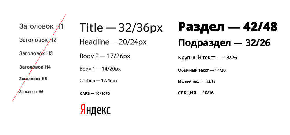
Design system must be meaningful. It is better to determine not the faceless headings, but the types of inscriptions actually used: section, subsection, large, plain and small text. Thus did Yandex. For My business, we offer a ready-made set of headers with indication of size and leading.
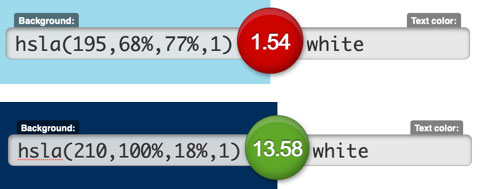
Let's check these colors for compliance with the Web Content Accessibility Guidelines (WCAG) 2.0 standard, which, among other things, sets the interface contrast color standard.
We use the site www.contrast-ratio.com. We indicate on the website the background color is blue in HSL space, and the text color is white. Get the contrast ratio 1.54 and a tooltip: Fails WCAG 2.0. This means that this combination of colors does not meet the minimum contrast requirements for interfaces.
Choose a deeper blue color (# 00182F), check its contrast, we get a positive result.
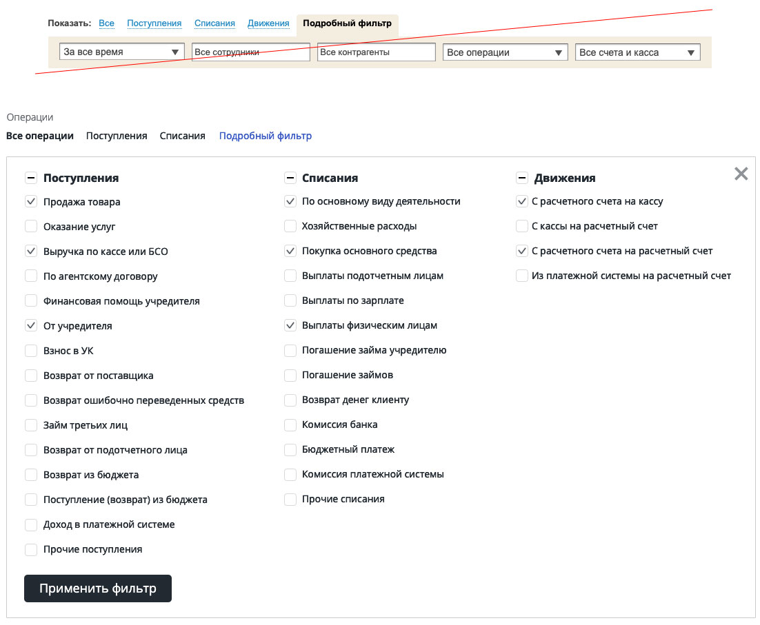
The filtering interface by type should be divided into simple and detailed. This will not be a newcomer-professional dichotomy that Jeff Raskin so criticized in his book Interface. The dichotomy is held here on the basis of demand. Simple interface contains more popular filtering methods, detailed is less popular.
A simple interface should be allocated for quick access and placed in the most accessible place. This filtering method is the most popular.
The detailed interface should be divided into groups according to the type of operation and separated from the simple one, since advanced filtering is used less frequently.
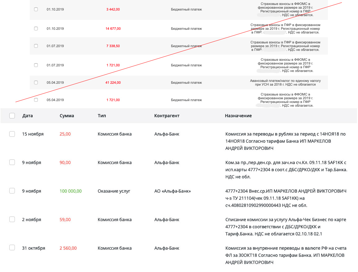
The button for downloading the payment order and the button for downloading the invoice should be excluded from the table. These buttons are used extremely rarely, cluttering up the table as a means of displaying data. Buttons should be transferred to the window for viewing and editing the operation.
The values of the amounts of receipts and write-offs should be highlighted in green or red. This display is quite enough for 100% of users, including color blind: they distinguish between red and green, they do not differ only in their shades. Therefore, the indication by signs - and + should also be removed from the table. It interferes with perception. Signs are repeated, visually grouped by the brain and look like noise or spots. The numbers in this case are aligned to the left because they are not used for comparison.
For the same reason - due to the visual grouping of similar elements - the date should be displayed in human format: “March 5”, and not “03/05/2018”. The year should be indicated only for operations of the last year. That is, if the operation was performed on March 5 of the current year, it is written: “March 5”. If the operation was last year, then the entry will be "March 5, 2017". The constant repetition of the number “2018” is grouped by the brain during perception, so the columns are much more difficult to read.
For the same reason, the ruble sign is also excluded from the amount column.
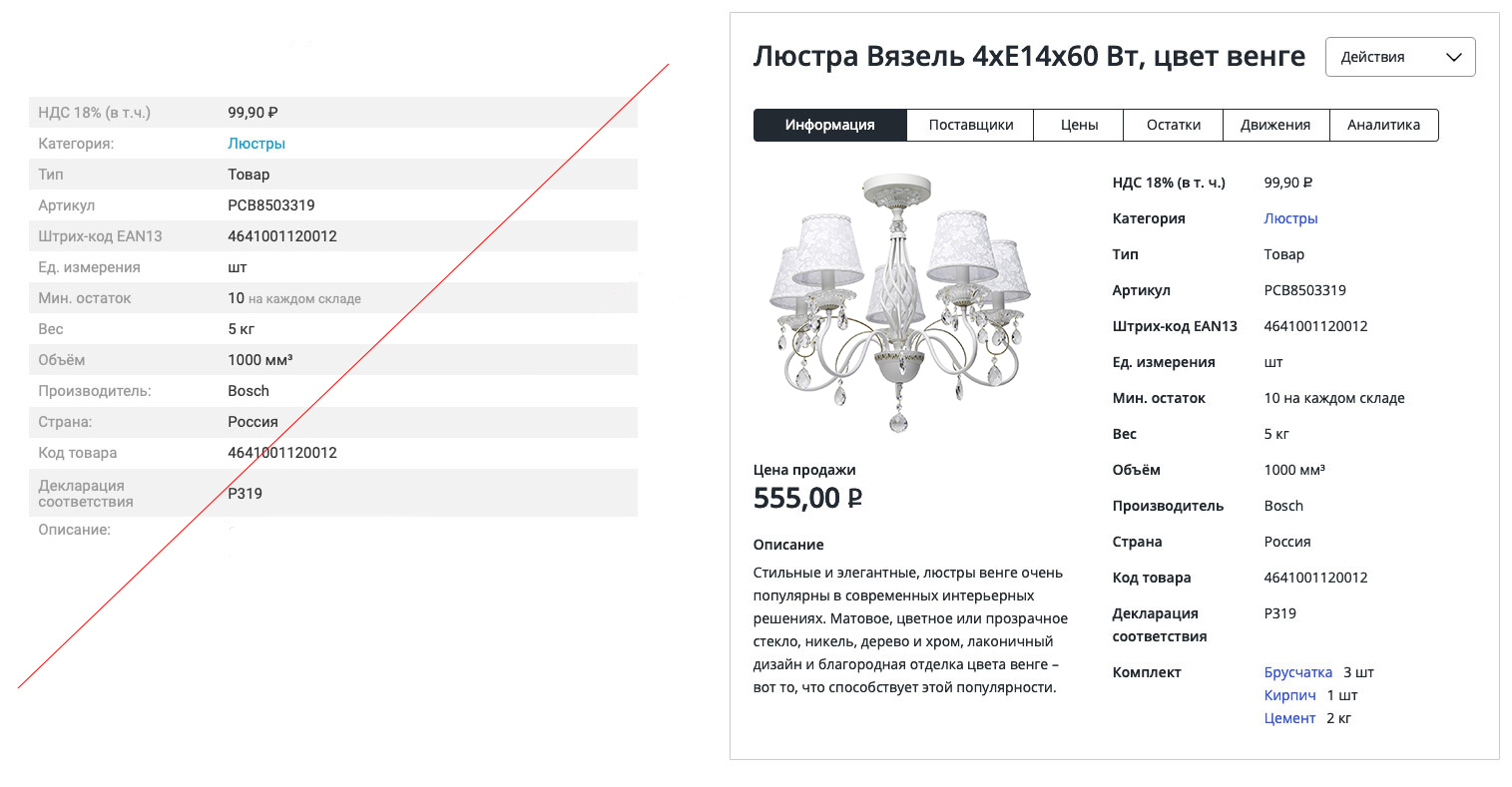
The card of operation is unique in the sense that all the data in it together are perceived as a single logical and visual unit. Therefore, if at least one field is misplaced, the entire card is misunderstood.
The task of information design is to give information as structured and monotonous as possible. When reading such cards, nothing should distract from the linear, sequential, monotonous viewing of information. This can be compared to reading a book.
In the presented design, the main error in the disorder of the fields. Fields in the card are at odds with each other. If you draw an analogy with a book, you can imagine that a single story is divided into three columns, then two, then merged into one narrow column, after which it is spread over a huge sentence across the entire width of the page.
It is necessary to alter the card completely by placing the fields one after the other.
Zebra design applies only to data tables. In them, the zebra serves to facilitate the reading of rows when there is too much uniform data in the table. Zebra is absolutely impossible to use in the form in which it is made in the proposed design. A zebra actually separates even and odd fields so that they cannot be confused. Using the zebra in the product card, we, it turns out, alternate a set of homogeneous data. It reads like this: “Or VAT, or a category. Or type, or article. This should not be, all data should be read sequentially, as lines of text.
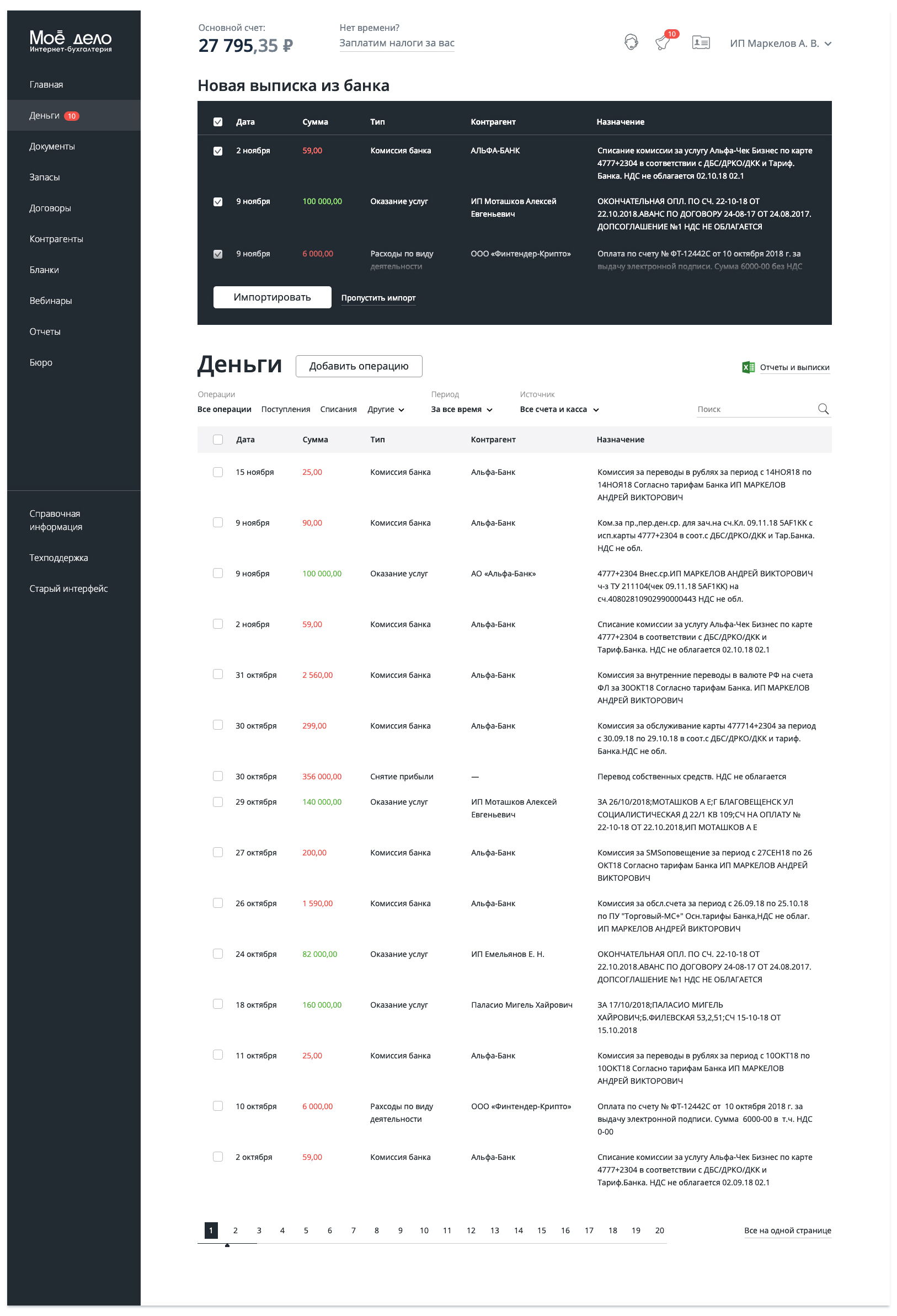
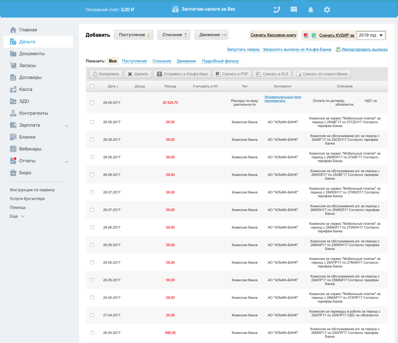
Also in the context of the audit My case has been proposed to redesign the main page. This is the current service interface.
A new interface could be like this.