Savvy Architects logotype design
Savvy is an architecture bureau doing its job fast and efficiently. Their missions are to be a step ahead, to build projects using new technologies and fresh ideas.
The company needed a logotype build on a great idea, but a very simple logo.
Client: We need a logo based on text. No graphics
Designer: Ok
In the word “SAVVY” a rhythm is clearly visible in letters A-V-V. Impossible to ignore, let’s use it.
We can also put it in a frame. And add “doors” so it would look like a part of a room drawing. This wave of AVV recalls to architecture also.
Client: Well, not bad. But the frame is secondary. And it looks a little boring. Please play a bit with letters
Ok, let’s play with letters. Easy to say! The combination of two V is too rare in English, only 7 words have it, “Savvy” is among them. In other words VV merged into W long time ago.
Client: Boring. Need more.
No problem, trying ligatures.
Client: Wrong. Try something else.
Trying different fonts. Maybe some Art-deco?
Client: Wrong.
Client: Wrong.
Client: Wrong.
Client: Wrong. Let’s make it just text, maybe?
Designer: Well, suddenly! As you wish, sir.
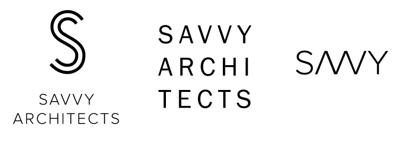
The idea of the logo is that every simple thing is built from innumerable small parts. As you can see in the interactive animation above, this simple and plain logo explodes to a thousand of particles flying around the mouse.
The caption itself is written with PF DIN Medium, letter spacing set to 200. It is a special typeface developed in Germany and widely used in drawings and architecture.
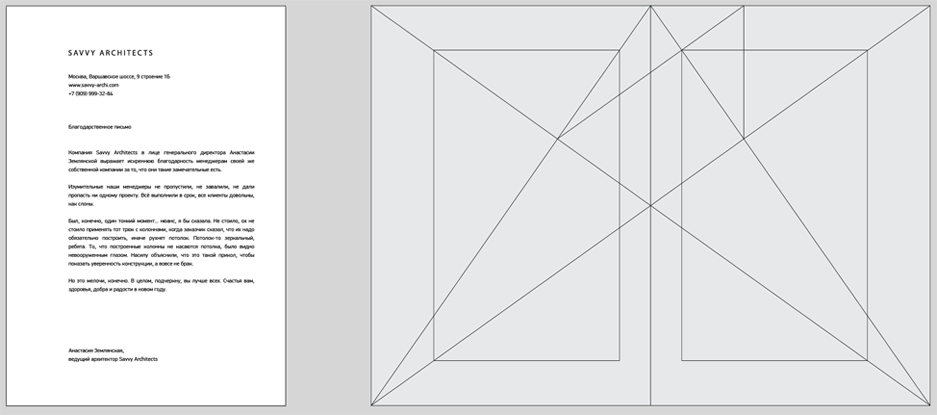
Identity includes business card and letter blank.
Simple does not mean primitive. For example, the layout of the corporate form is designed according to the antique book ratio.