Savvy Architects corporate website development
Previously, for the Savvy Architect, a logo was developed.
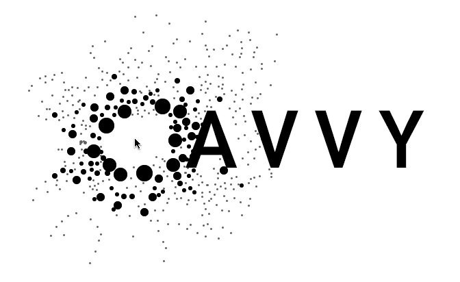
The idea, embedded in the logo: One of many small details — is embodied in the interactive animation on the site. It's now impossible to leave the main page: users play with animation on average about 2 minutes.
Making a first version. The idea is a simple website easy to present on business meetings
Designer: Here. Simple, plain and easy to tell about.
Client: Hm. Are you sure? We need some central idea, on which we’d build our style. Something special and very cool. A mini-game or an animation possible.
Designer: Let'me think for a while.
After a weekend
Designer: Got it. Let’s make our logo blowing into particulars when mouse hovers it? For example, letter S would break into many little Ss.
Client: What’s the matter?
The idea is that Savvy and what you do is made up of many little pieces. And it is simple only on the first sight.
Client: Not bad, but how it would animate?
Designer: Well, our programmer will work it out. Here are some demos: one, two, three.
Client: Can’t dig it.
Designer: Ok, something like this.
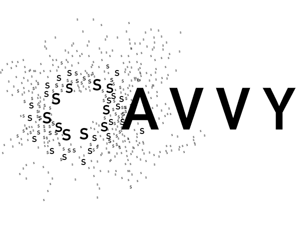
Client: Ok, cool. But let’s use simple shapes, not letters
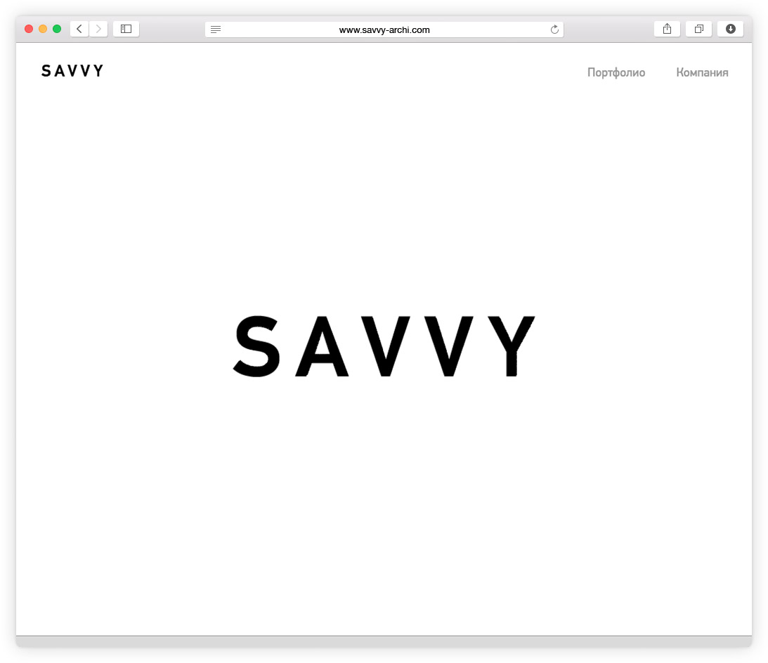
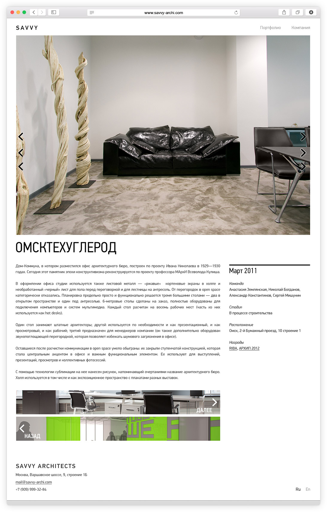
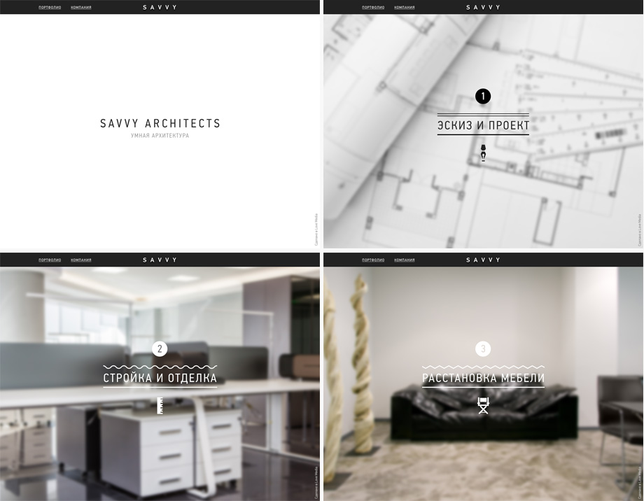
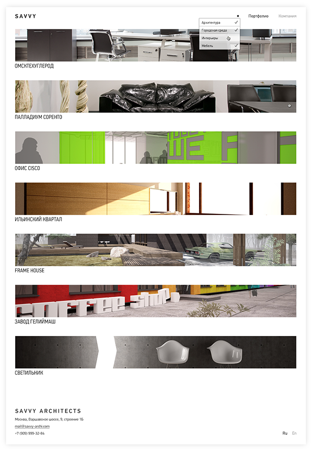
The portfolio home page is as simple as the whole site. The path to this simplicity was very long, like the whole work on the project.
Making portfolio page. Case 1 with carousel, case 2 with tiles
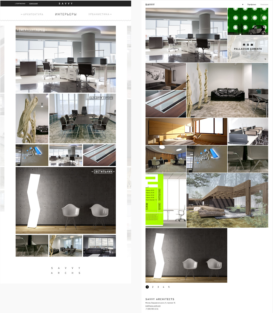
Client: No, we don’t need any of this. Can we use strips of photos on full width?
Designer: A little boring I think, but as you wish.
Client: That’s it, but throw away those letters too.
Designer: Got it
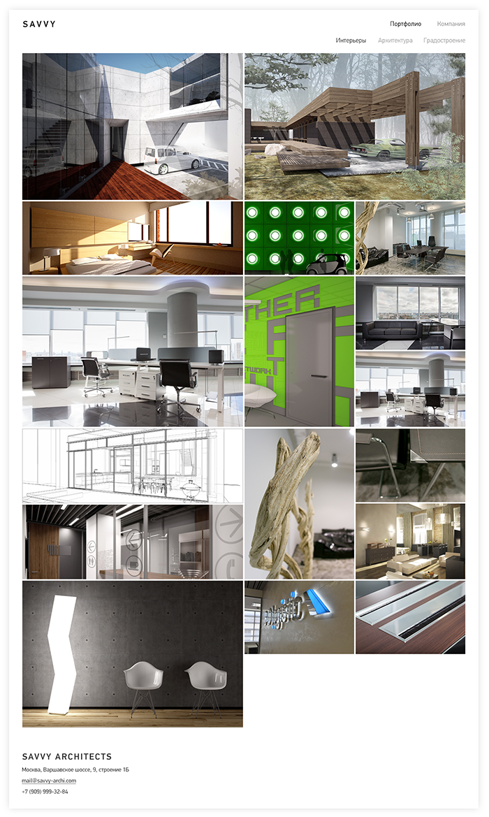
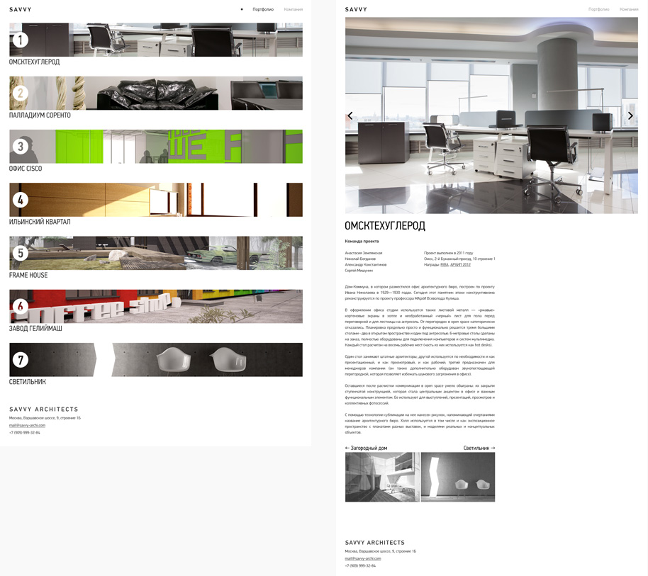
Projects pages are designed like a glance magazine. Big pictures, justified description and project details. German PF DIN typeface is also well for architecture.