Logo creation for K. C. Equipment
K. C. Equipment operates in California and repairs pavements as well as does road construction. For the company it was necessary to develop a simple, recognizable logo.
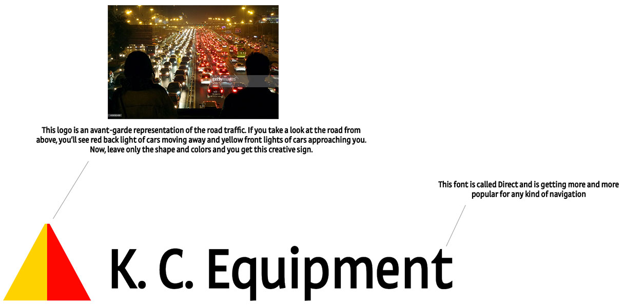
The first idea for the logo was the avant-garde image of the car traffic. The back and front traffic flows in their most simplified form look like yellow and red triangles converging at the same point.

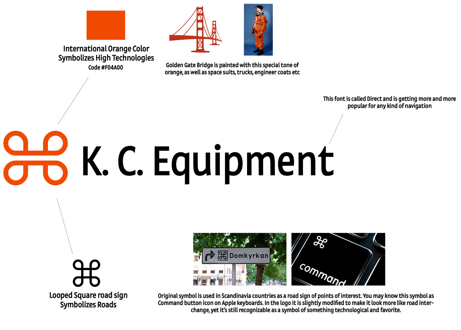
The client did not accept this logo. A second option was proposed. The „frog“ symbol is taken as the emblem. It is a well-known symbol from the keyboard of Apple Mac computers, meaning the command button. This symbol comes from a road sign adopted in the Scandinavian countries. It denotes sights along the road.
The symbol has been modified to look like a road junction. A special space orange color is selected for the symbol. The same one that is used in space suits and on the Golden Gate Bridge. Direct is selected as the font.

The logo is accepted and approved by the client.


